
This infographic’s title, ‘Top $$$$ Athletes by Gender,’ is prominently displayed at the top in bold text, immediately grabbing readers’ attention. The font and positioning of the title make it easy to grab readers’ attention. In the middle, supporting statistics compare the top earners of male and female athletes in the middle of the graphic. This graphic has done a good job of effectively guiding the viewer’s eye to individual rankings and deeper insights.
The graphic’s striking color choices ensure the data and information are easily read. Yellow and gold often symbolize wealth, making them a fitting color scheme for a financial comparison. The white and black comparison on the yellow also helps clarify the information sections.
Looking at this infographic, I noticed how visually appealing it is. There is a good distinction between visuals and writing. I like how neither overpowers the document, allowing it to be easy on the eyes and straight to the point.
This infographic did a good job of telling a story with the data they wanted to represent. It makes a strong statement about gender pay disparity in sports without including long explanations to explain further.
- The data is also contextualized through key insights, including the note that Grand Slam tennis events offer prize money that highlights an exception for the key trends of total earnings.
- It is shown visually that only 2 of the highest-paid athletes are women, reinforcing the overall message of gender imbalance in overall sports earnings.

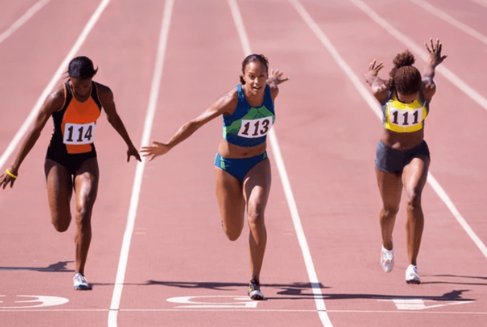
This infographic showcases female athletes’ strength, speed, and skill by presenting world athletic records visually engagingly. The graphic is divided into three sections based on the Olympic motto:
- Citius (faster) – sprinting and distance running events
- Altius (higher) – jumping events
- Fortius (stronger) – throwing events and heptathlon
This structure organizes information logically, allowing readers to grasp women’s dominance in various sports. Bold numbers emphasize key records, making vital statistics easy to see.
The three distinct color blocks (yellow for speed, blue for heights, and orange for strength) help differentiate the different event categories. There is a contrast between the text and background, which ensures easy readability without having to overview the reader.
Using athlete illustrations brings movement and energy to the design, ensuring that the infographic remains engaging rather than data-heavy.


